Node dashboards
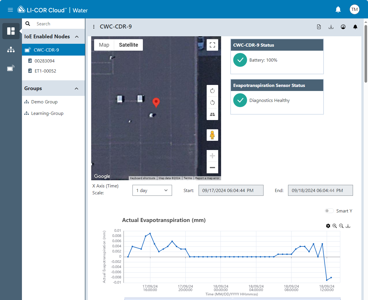
Node dashboards present information about IoE-Enabled Nodes that you own or are available to you. The dashboard presents a list of sensors on the node, a map indicating the position nodes, and graphs of data from the selected node.
Viewing the map
The map shows the location of nodes. It will automatically zoom to fit all nodes that are in the group.
Selecting a sensor on a node
To view data from only one sensor on a node, you can select it from the list and LI-COR Cloud™ will display data from that device only.
Working with graphs
For graphs, you can select a range of days to display. The start and end dates represent the date range. Each graph allows you to adjust the x-axis to zoom in and out simultaneously for all figures displayed.
-
 Click Settings to select a different variable to display.
 -
 Zoom in if you'd like a closer look, or use the scale bars below the graph to adjust the x-axis time.
 -
 Zoom out: click to restore the default scale.
 -
 Click Download to save an image (
.png) of graph your computer.
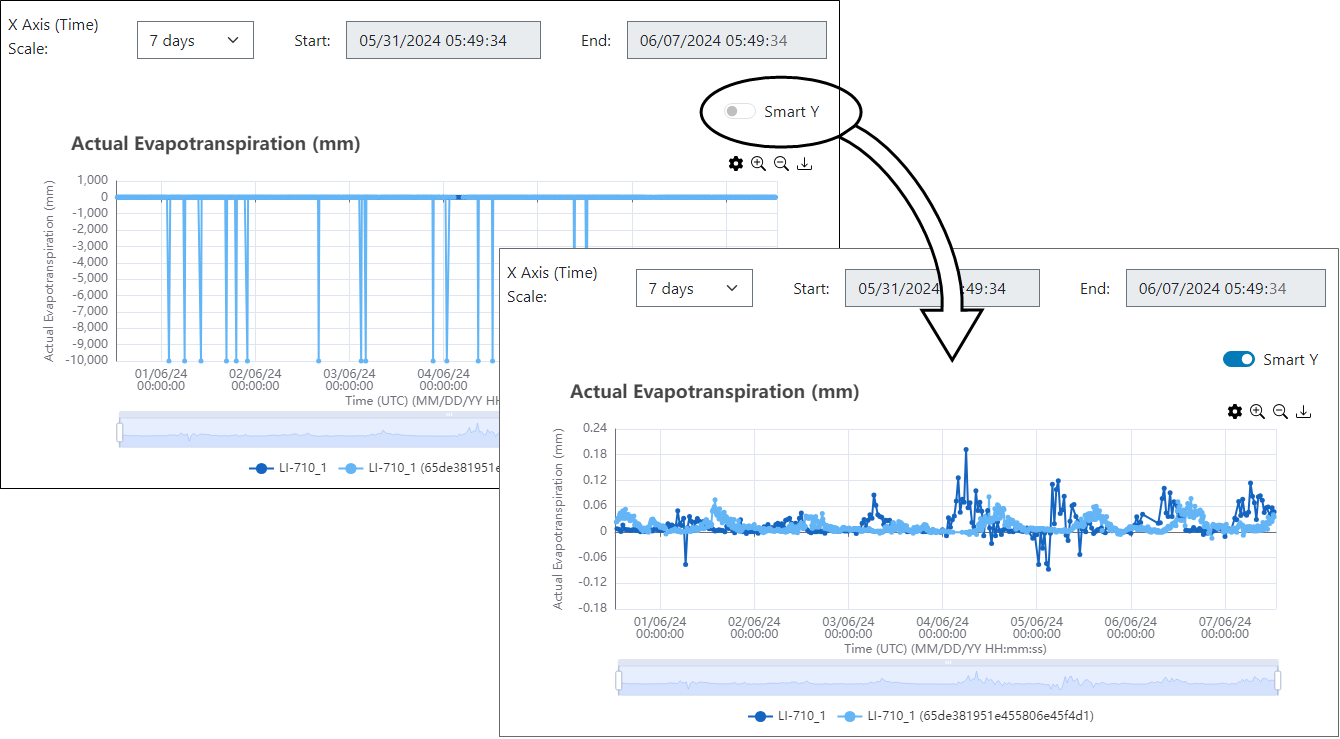
Smart-Y is a statistical adjustment to the displayed data. When applied, the graph displays the median ±10× the interquartile range. This is especially helpful if the y-axis has a large range of values that obscure finer details.